Getting all “bubbly” over that spending “bubble?”
Let me just say that I hate this graph!
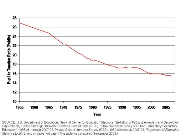
FIGURE 1 – NATIONAL TRENDS IN PUPIL TO TEACHER RATIOS
Why? Well, this is my own version of the graph… but it is a graph that has been used many times over, of late, to make the argument that American public schools have simply been drowning in an excess of public funding for decades and that public school districts nationally have leveraged all of that additional money over time to

