Friday Graphs: Bad Teachers? or Bad Policy & Crappy Measures in New York?
A while back, I wrote this post explaining the problems of using measures of student achievement growth to try to sort out “where the bad teachers go.”
The gist of the post was to explain that when we have estimates of student achievement growth linked to teachers, and when those estimates show that average growth is lower in schools serving more low income children, or schools with more children with disabilities, we really can’t tell the extent to which these patterns indicate that weaker teachers are sorting into higher need settings, or that teachers are receiving lower growth ratings because they are in high need settings. The reformy line of argument is that it’s 100% the former. That bad teachers are in high poverty schools, and that it’s because of bad teachers that these schools underperform. Fire those bad teachers. Hire all of the average ones waiting in line.
Even the best measures of student growth, linked to teachers, addressing as thoroughly as possibly numerous contextual factors beyond teachers control, can’t totally get the job done – isolating only the teacher…. well… classroom level… effect. And, as I’ve noted in previous posts, many if not most state and district adopted measures are far from the best.. or even respectable attempts.
I explain in this policy brief, that in New Jersey, factors including student population characteristics, average resource levels available in schools, competitive wages of teachers (relative to surrounding districts) and other factors are significant predictors of differences in school average “growth” ratings. Schools with more resources and less needy students, and higher average scores to begin with, in New Jersey, get significantly higher growth ratings.
I also showed in this post that in either Massachusetts or New Jersey, teachers in schools with larger shares of their populations that are female, are less likely to receive bad ratings (Mass) or, conversely in schools that receiving higher growth scores (New Jersey). The implication, accepting reformy dogma about what these measures mean, is that our best teachers are teaching the girls.
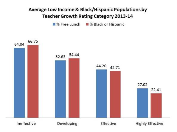
So then what about those New York teacher ratings I addressed in the previous post. We saw, for example, that teachers rated “Ineffective” on the growth measure tend to be in high poverty schools:
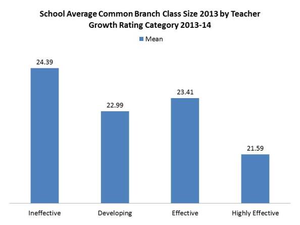
Tend to be in schools with larger classes:
And those really effective teachers tend to be in schools with lower poverty and smaller classes.
So, does that mean that the “great” teachers are just getting the cushy jobs? Or is the rating system simply labeling them as such? While there may indeed be some sorting, especially in a state with one of the least equitable funding systems in the nation, it certainly seems likely that the estimates of teacher effect on student achievement growth… well… simply suck! They don’t measure what they purport to measure.
They measure, to a large extent, the conditions into which teachers are placed, and NOT the effect of teachers on student outcomes.
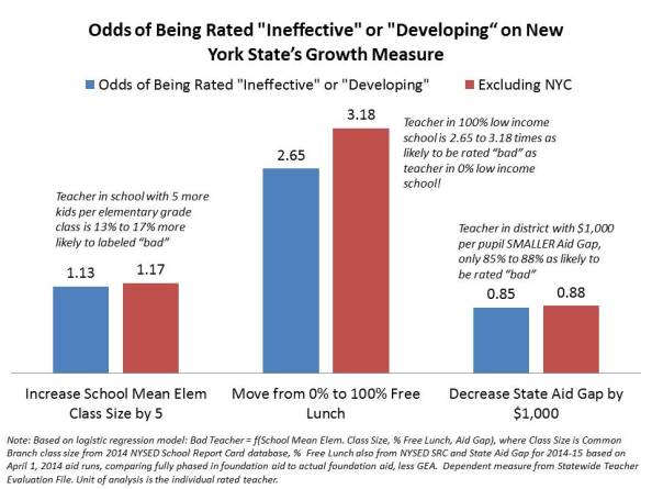
Combining the above factors into a logistic regression analysis to predict how a handful of conditions affect the likelihood that a teacher is rated either “ineffective” (you really suck) or “developing” (you kinda suck, and we’ll tell you you really suck next year), we get the following:
So, even when considered together (holding the other “constant”), teachers in schools with larger classes (at constant low income share and funding gap) have greater likelihood of being rated “bad.” Teachers in schools with higher low income concentrations, even if class sizes and funding gaps are the same, are much more likely to be rated “bad.” But, teachers in schools in districts that have smaller state aid gaps, are less likely to be rated “bad.”
So, on the one hand, we can stick to the King’s grand plan….
- Step 1 – Disproportionately label as “bad” those teachers in schools serving more low income kids, and doing so with fewer resources, including larger class sizes, and dump those lazy failing teachers out on the street…
- Step 2 – Wait for that long line of “average” teachers to sign up to take their place… stepping into the very same working conditions of their predecessors, which likely led, at least in part, to those bad ratings….
- Step 3 – Repeat
And the cycle continues, until a) those conditions are improved and b) the measures for rating teacher effect are also improved (if they even can be).
Alternatively, maybe the actual policy implication here is to a) reduce aid gaps and b) use that funding to improve class sizes?
UPDATE –
I figured I’d go check out that gender bias issue I found in NJ and MA. And wow – there it is again. I’ve rescaled the low income concentration and female concentration effects to relate odds changes (of being labeled bad) to a 10% point shift in enrollment (e.g. from 50% to 60% low income, or female). Here are the Friday Graphs: Bad Teachers? or Bad Policy & Crappy Measures in New York? | School Finance 101:


