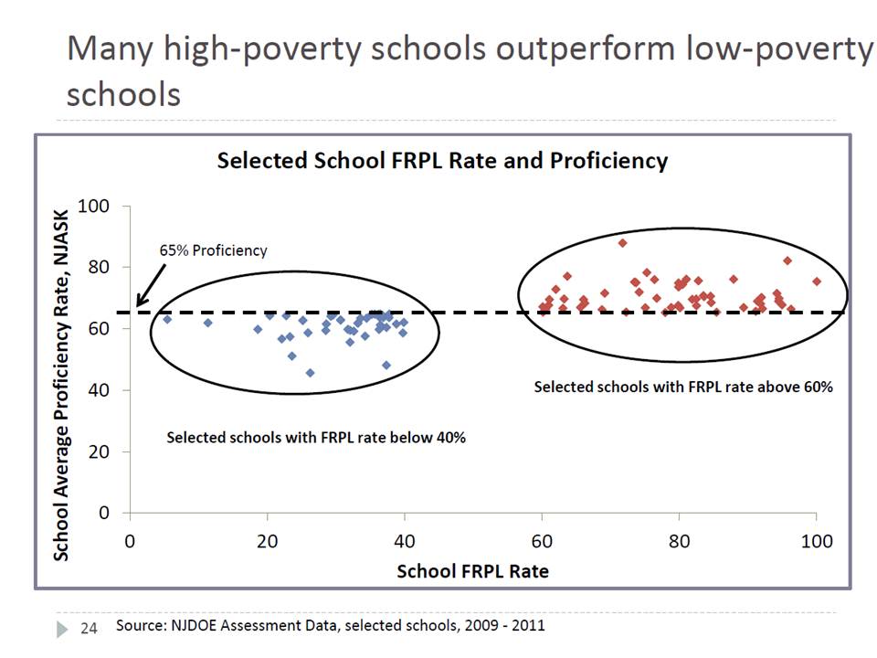
Amazing Graph Proves Poverty Doesn’t Matter!(?)
I just couldn’t pass this one up. This is a graph for the ages, and it comes from a presentation by the New Jersey Commissioner of Education given at the NJASA Commissioner’s Convocation in Jackson, NJ on Feb 29.State of NJ Schools presentation 2-29-2012
Please turn to Slide #24:
 The title conveys the intended point of the graph – that if you look hard enough across New Jersey – you can find not only some, but MANY higher poverty schools that perform better than lower poverty schools.
This is a bizarre graph to say the least. It’s set up as a scatter plot of proficiency rates with respect to free/reduced lunch rates, but then it only includes those schools/dots that fall in these otherwise unlikely
